Presentation basics

Always use our PowerPoint templates as a starting point. Do not create new presentations from older templates. Avoid merging old templates into our new system as formatting may be comprised. For PPT support, contact brand@onetrust.com.
Theme colors
Theme colors are built into our templates. We primarily use green and white. Black and dark gray are used for type. Secondary colors are used as accent colors within charts and graphs.
Always use our theme colors to ensure our presentations are on-brand. Color can be accessed through the highlight, font color, shape fill, and shape outline menus.
Additional guidance can be found within our template.

Presentation fonts
Our presentation templates use Univers, a system font, with similar weights and the same general type hierarchy principles of our brand fonts. Never use Univers for brand expressions. Visit the Typography section for rules on type accessibility

Best practices
Consider audiences and the little amount of time they have to take in information. Create maximum impact by editing content to include the most important information.
Do this
A headline with a clear message
Easy to navigate information
Simple, thoughtful content
Don't do this
Too many messages in a headline
Too many details/graphics
Content that is too dense to absorb
Charts and graphs
Our presentation templates include two-color and multi-color options for charts and graphs. Choose the best option to help your audience quickly understand the meaning. Keep numbers outside of graphics to ensure legibility.
01. Two-color


02. Multi-color


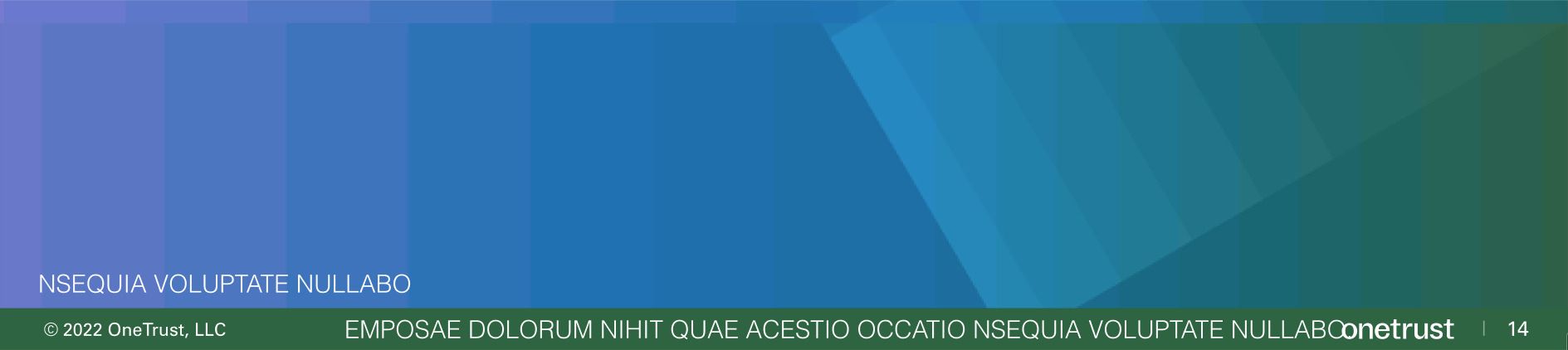
Footer details
Use template footers as they were provided. Avoid adding additional clutter.
 Do this
 Don't do this
Watch outs
Some scenarios to avoid in presentation templates.

Do not alter template content placement, colors or styles. Use template elements as they are supplied.

Don't use dense copy that is hard to navigate

Don't use off-brand colors or colors that are not legible behind graphics or typography

Don't use charts over phototography
Quick links
Know what you need? Here are some quick links to our most frequently needed assets.